This week in web design, we are starting to design our websites by answering questions about our overall approach as well as develop a basic layout for what we hope to achieve.
Questions
What is the purpose of the website?
I plan to use this website to mainly my portfolio work from Parsons, as well as sketches and projects I’ve work on in the past during my free time. Although we were given portfolios by the school for our work with WordPress, I don’t really like using the default themes and would like to create a portfolio that sort of flows better and is more suited for my style.
I also want to integrate this with some marketing research I have done in the past while I attended NYU.
Who is the intended audience?
Potential employers peers, and anyone who might stumble upon the website. I hope to create a fully functioning website that I might be able to transfer the coding later on onto WordPress or some sort of blogging platform.
What tone do you want for the site’s written content?
The portfolio posts might be more formal as a lot of my work does contain a lot of essays. However, I also want the tone to be more lighthearted to reflect more of my personality rather than being so informational. I really want this website to be a place where I can just show the world who I am and I can write freely the things I want with no particular focus
Design
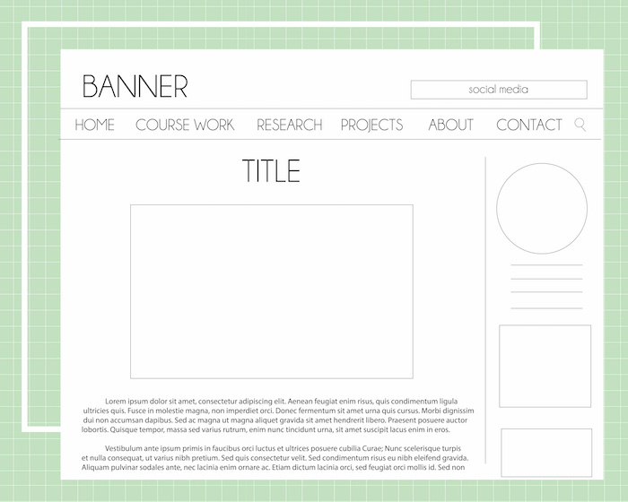
Landing Page
I used to run a blog called monkeychic.com. I have had this blog since I was in middle school and it basically shows a progression of my interests and what I have learned throughout my life since then. I stopped seriously blogging around high school and used the blog to primarily just post marketing projects I have worked on in school or work I have completed in Parsons. However, some of the pictures and links are broken.
I really want to use this project to do a complete make over of my blog/portfolio and make the entire thing just flow together better while also just primarily focusing on my project work.
My landing page is going to be a tricky thing to design as I don’t have a whole lot of photographs of my work that I am too proud of. Some of my content sometimes is all words and no images. Some of my posts have a lot of images, but none I am too proud of. Some my posts might have a particular image I want to really showcase.
So for the landing page, I am thinking of first creating a carousel to display any posts I really want to feature.
Below I will just have previews of recent posts. My biggest concern for this is that since not every post has a photo, but some will, these previews have to look nice whether or not the post features any image. I may turn these black and white or fade them as well so that the photos don’t have to have a particular style and still work well.
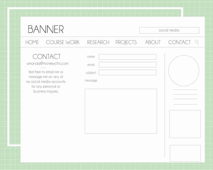
Navigation
The portfolio section will have three categories; projects, parsons, and research. Projects are going to be the main portion of this category. After school is over I still plan to use my site as my main portfolio website and I want to be able to post any project whether they are simple sketches or full blown designs onto here. Parsons will focus on any work I complete during my past and remaining years at Parsons. Lastly, Research will be where I will add all my old marketing projects from courses I had taken at NYU and I will continue adding to this in the future if I continue doing some more research projects.
The portfolio categories will also have their own sub categories because for Parsons I want to be able to discuss which posts belong to which courses. For research, which posts are from when I was in NYU and which are going to be from the future. Projects might have more categories to divide which projects are digital projects, hand done, sketches, and miscellaneous (things I work on that doesn’t fit in a particular category, resources, or inspirations).
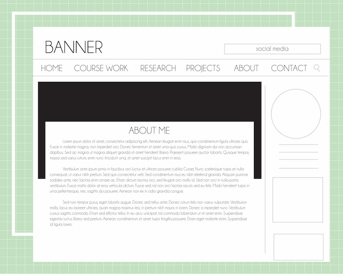
My navigation will be displayed on the header, a side bar and may be certain links on the footer.
Secondary Content
Home, About, Social Media and Contact Me (email)
Sidebar
Short About Me and Picture, Contact Email, Subscribe (Email, RSS, Bloglovin), Social media (Instagram preview), Archives (By Month), Recent Posts, Digital NYU Certificates
Inspiration
http://www.thewonderforest.com/
http://blog.boatpeopleboutique.com/
https://laurenconrad.com/blog/2016/03/welcome-to-the-new-laurenconrad-com/
http://thebeautydepartment.com/
http://cargocollective.com/briemery
http://www.wix.com/blog/2015/12/15-magnificent-websites-created-by-artists-and-illustrators/
Website Tree

Layouts
Landing page

Post Page
About Me
Contact Sheet