Matchbook Final

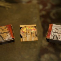
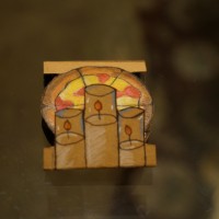
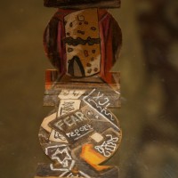
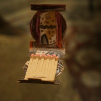
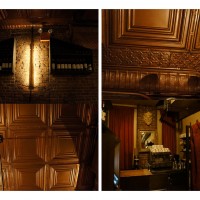
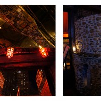
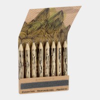
For the past couple of weeks in Product, Promotion, and Packaging the class had worked on the completion of creating matchboxes for a restaurant that had been assigned to us while using elements found throughout the restaurant to convey a certain theme. My restaurant had been Three of Cups, which is a moderately priced Italian Restaurant with a lounge and bar below it. The pictures items that I used to represent the restaurant were a brown tin ceiling of the restaurant, rock band stickers pasted on the ceiling of the lounge, brick pizza oven, candles, pizza, and swords.

Originally I had made a digital layout to create the concept of my design, but as I played around with it I realized that I would prefer to just hand draw it as I did not like the flat look of my prints. I had recently been following a Youtube channel called DramaticParrot who creates beautiful illustrations of cartoons and Disney characters using color pencils and decided to give her method a try.

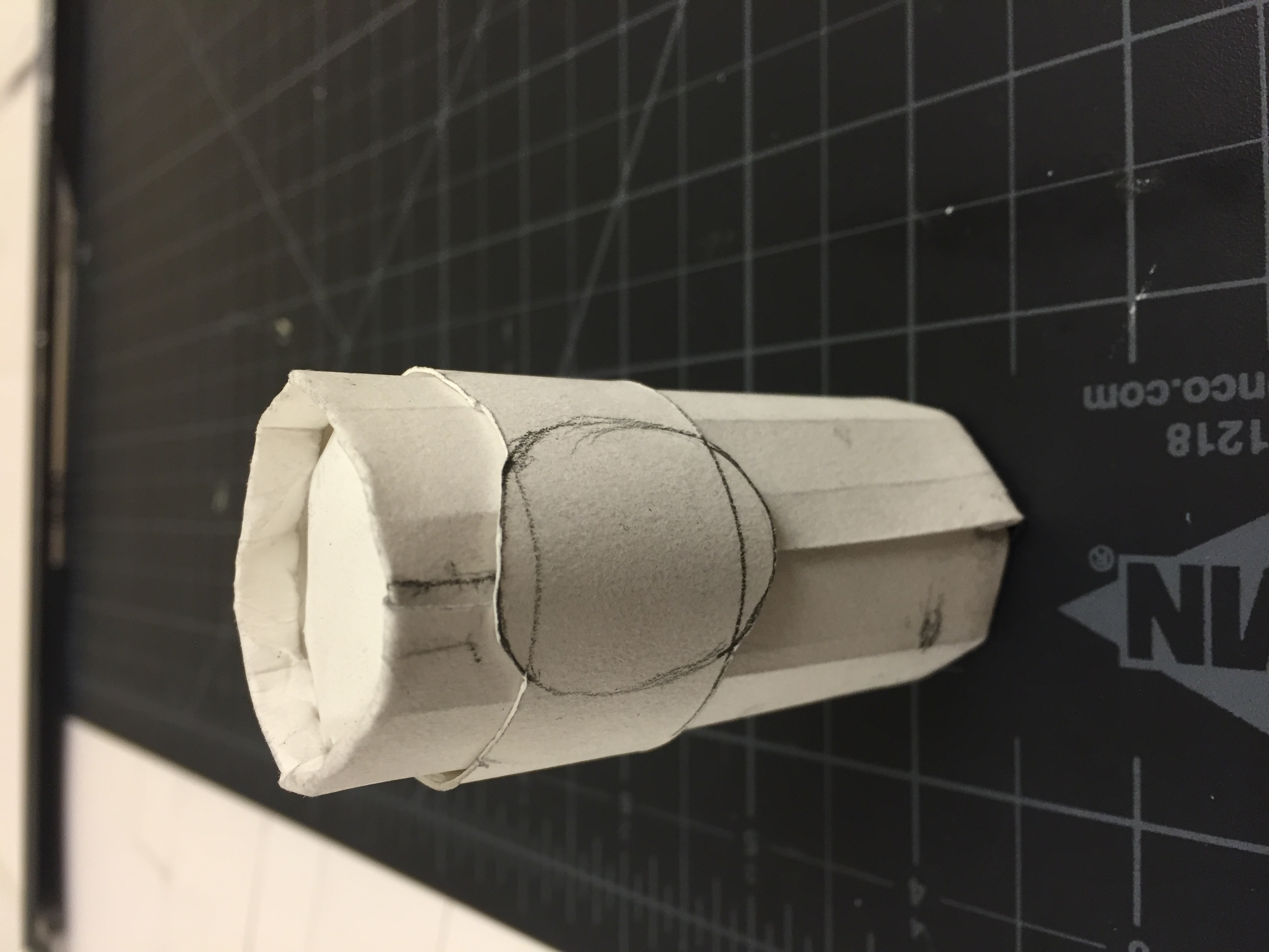
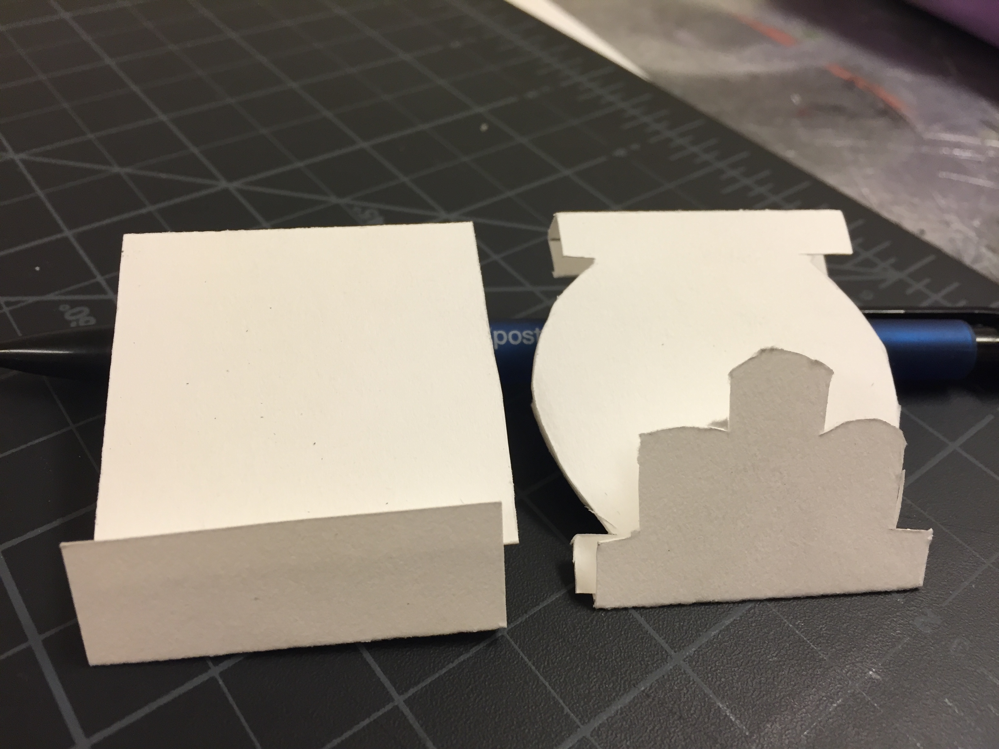
The trickiest part of this project was probably sizing. that round matchbox worked out well, but I had a little trouble when it came to the pizza box. My first version wouldn’t stay close; probably because the tabs were not the best size. So I decided to play around with belly wraps. I then got the idea to make a second pizza box and use a vellum paper as the belly wrap and draw the image of the candles and stove onto it so it’s as if it turns into a separate packaging. I definitely like this design better.

Here are links for my process of layouts and inspirations:

This process was a lot of trial and error, but overall I like the last results and appreciate the process it took me to get the piece to where it is.

Matchbox Packaging First Layouts

This week’s assignment for Product, Packaging and Promotion was to come up with 4 different concepts for our Match booklets and well as create mock ups for how the pieces are to be built. I built three different shapes of books and boxes. One book takes the shape of a pizza and the other is just a traditional square shaped book. My next design is shaped like a pizza box to fix with the main food of the restaurant and the last one is a cylindrical shaped box.


Matchbook 4 Matchbox 1 Matchbox 2 Matchbox 3

IMG_3361 IMG_3362 IMG_3363

Three of Cups Photos and History

Three of cups is an Italian Restaurant in the East Village. Surrounding it are many other international restaurants, bars, and cafes. Below the restaurant is a lounge that has happy hour everyday and live music as well as an open comedy show on Wednesdays. The upper restaurant has a very warm atmosphere and medieval themed decorations along the walls. Brick and wooden walls line the place. The restaurant also has candle lighting throughout. The lounge is much darker and has old band stickers plastered on the ceiling and band posters and creepy masks along the walls.

The Lounge attracts many punk-rockers on week days and “weekend warriors” – http://nymag.com/listings/bar/Three-of-Cups-Lounge/

For the food, they serve primarily pizza and pasta and make use of their wood burning oven.

“The name is derived from an Italian deck of playing cards called “Modiano” which dates back to the 14th century. The Three of Cups is a wild/trump card in the games Scopa and Briscola. The deck is similar to the tarot card deck.” – http://www.threeofcupsnyc.com/

Three of cups opened in December 1992 by Phil Hartman and Santo Fazio who used old family recipes to make their creations.

Weekdays the place opens at 5pm for dinner, but on weekends you can go earlier for brunch.

Matchbook/box Inspiration