Mötorhead Final Project

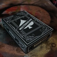
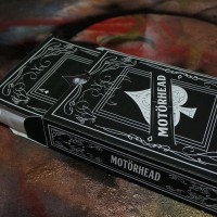
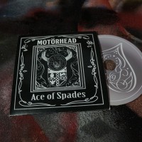
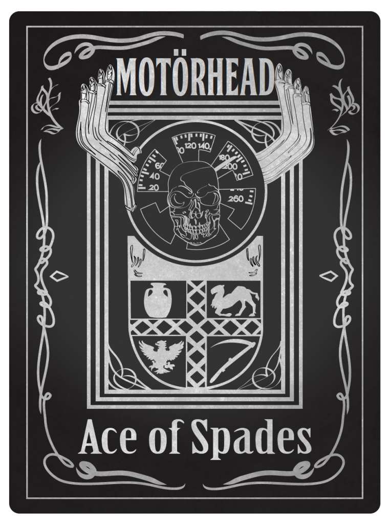
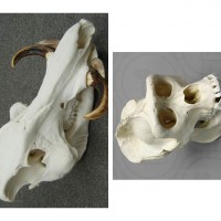
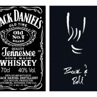
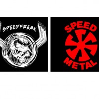
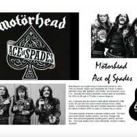
For the past few weeks the class has worked on creating packaging for an artist to promote a re-release of a single. Our song had been “Ace of Spades” by  Mötorhead. We used six images for inspiration which included the Jack Daniels logo, a rock on hand, speed metal symbol, speed freak symbol, coat of arms for the town Lemmy Kilmister was born in, and dead man’s hand.

Below are some links of our designs and inspiration in progress:

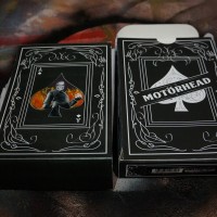
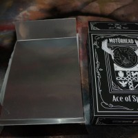
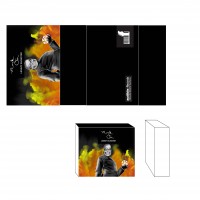
There was a debate on whether or not my partner and I would make both of our packaging designs for our project. We wanted to make the first design only so that we could focus our energy on getting our T Shirt printed. We knew once we had the shirt finalized that it would come out well and hoped to produce a complete product. In the end we integrated our second design with our first design by creating a card to pull out with the items on the inside.

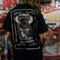
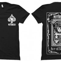
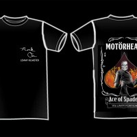
We had an issue with getting our T-shirt printed because silk screening would cost around $100 for one T-shirt and the price only lowered if we bought it in bulk. We tried to print black ink on a white shirt instead with a digital printer, but it didn’t give the same heavy metal feeling the white ink on black did. We finally found a place in New Jersey called Flexy Custom Apparel to cute iron ons for us, but they only had the tools to print the parts of the design that were thick enough. The rest of the design that was too complicated I printed out onto a different type of iron on paper at home.

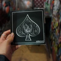
Another issue we had when making our final boxes was that in the design I had accidentally made the UPC code too small and we already constructed the boxes before we could reprint them. So my partner and I decided to make a sticker and print them at the computer lab to cover up the mistake.

This project was a bit of a challenge as both my partner’s and my own styles contrast a bit from the band. My partner tends to appreciate more of a minimalistic style and I like more pop punk artists rather than rock. However, even with different interests  I think our final results came out well. We ended up really trying to play up the biker side of the band through our designs.
MOTÖRHEAD “ACE OF SPADES” RE-RELEASE FAN PACK CONCEPT DRAFT 2

Concept 1

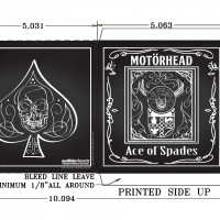
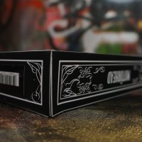
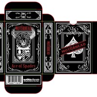
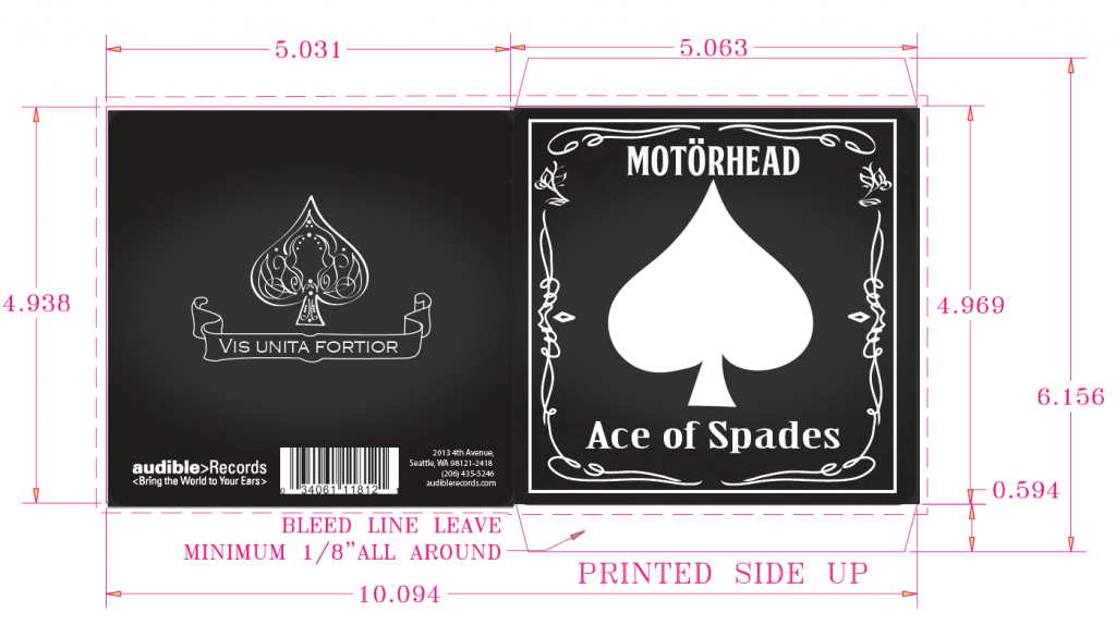
For this second iteration we didn’t edit the files too much other than resizing some of the thickness of lines. We did create a promotional packaging using the same images and will be shaped like a card box to hold all the items (CD, Poster, Tshirt).
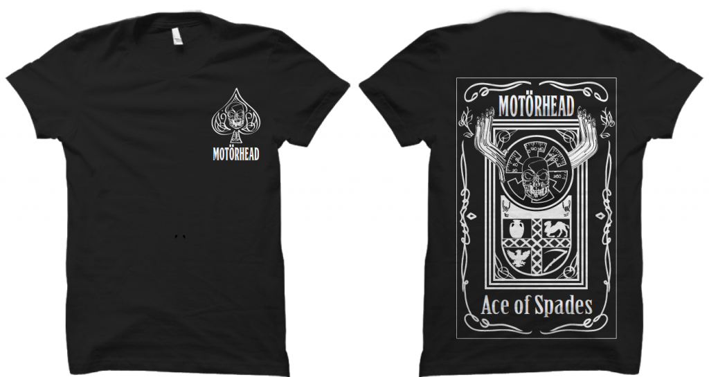
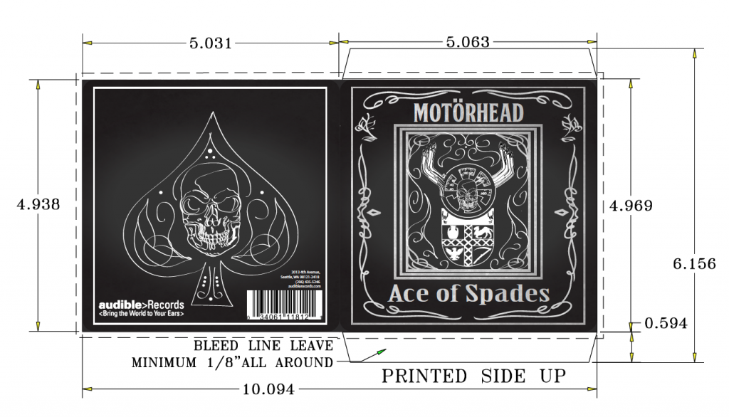
Concept 2

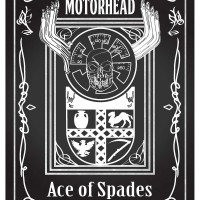
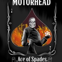
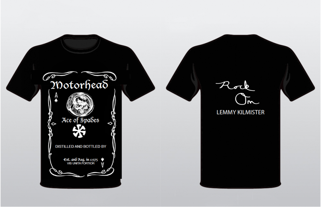
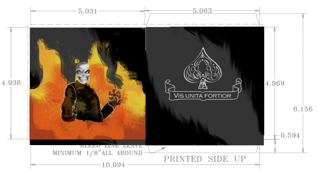
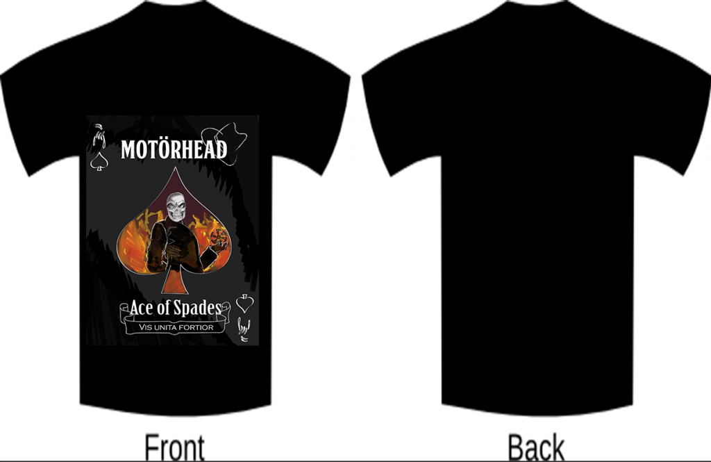
We put  more effort in editing this design. I finished illustrating the skeleton so that the drawing had a full and more defined body. Instead of the hat detail we used Elise’s Jack Daniels and Ace of Spades to border the design in the poster. We also did not want the UPC Code to look like it was just slapped on, so we decided to try playing around with that as well. We wanted the TShirt design to be a bit more subtle so we ended up making a small Tshirt pocket on the front which commemorates Lemmy Kilmister and the back would have the illustration.

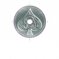
Another addition to the cd packaging we added was now the illustration is a folder to hold the cd and the spade will be a shiny metallic silver. Before we had the spade as cut out and the cd would come in two sleeves. So that the illustration was placed right under the spade. Instead the packaging will now be a book style.

Motörhead “Ace of Spades” Re-Release Fan Pack Concept Draft 1

For our final project in Product, Packaging, and Promotion; the class was placed in pairs to create three concepts of a T-shirt, fold up poster, CD, and sleeve.

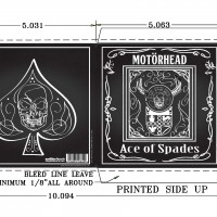
My partner and I decided to split the work by creating each creating our own individual concepts and then the last one we would collaborate together. For my piece, I based my design off of the back of a traditional poker card.

Screen Shot 2016-04-18 at 12.53.23 PM  Screen Shot 2016-04-18 at 12.53.50 PM Screen Shot 2016-04-18 at 12.54.06 PM

Screen Shot 2016-04-21 at 11.09.34 AM

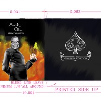
For our second piece, Elise had tried to lean towards making a tribute album for the lead singer Lemmy who died just last year in December.

Screen Shot 2016-04-21 at 11.11.52 AM Screen Shot 2016-04-21 at 11.12.02 AM Screen Shot 2016-04-21 at 11.12.10 AM

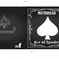
During the 80’s, a lot of the famous rock albums covers were heavily painted with very loud illustrations and for the last piece we tried to capture that feeling from that time period.

Screen Shot 2016-04-21 at 11.11.14 AM Screen Shot 2016-04-21 at 11.11.27 AM Screen Shot 2016-04-21 at 11.11.44 AM Screen Shot 2016-04-21 at 11.12.55 AM